Carol Tsai e-commerce
OVERVIEW
In this project we are faced with the following scenario: understand the local business objectives and the owner expectations and finally, present an e-commerce solution for the business.
Tools: pen & paper, CDS matrix, site map, interviews, empathy map, affinity diagram, persona, JTBD, user journey, card sorting, usability test, Miro & Figma.
Role: interview recruiter, ux researcher, benchmark, information architecture, usability test, prototyping.
Project time: 4 days
Deliverables
UX Research interviews and focus groups
Persona, Site Map and User Journeys
Wireframes
Interaction Design Prototype (Mid-Fi)
Therefore, my squad chose Carol Tsai, a ceramics artist and business owner, as the focus of analysis. We set out to generate as many positive results as possible for her business to improve the customer experience and increase sales numbers.
However, there seemed to be one issue that was causing us second thoughts: her e-commerce did not seem to need anything else! We were doubtful as to whether choosing to focus on her business had been the correct choice.

Photos from the artist’s collection, Cerâmica Carol Tsai
Stakeholder and the Business
To begin this project, we held a remote meeting with Carol Tsai to learn more about her trajectory working with ceramics.
We prepared an interview to understand her professional goals, production capacity, the differences in managing a physical store and e-commerce (she had launched her virtual store just 2 months earlier).
The questions script below was created together as a group. First, we created the questions separately and then discussed and organized them according to what we would like to discover and if it would be relevant to go deeper or not depending on the question.

Creating a script for our interview
When asking Carol the questions, we found out that her website solves a big issue, which is to concentrate information about the product, payment, shipping, information about the ceramics process and the artist, so that the customer does not necessarily need to contact her.
But Carol also pointed out these issues:
communicate better about out-of-stock pieces online
achieve, on average, the sale of 6 pieces per day

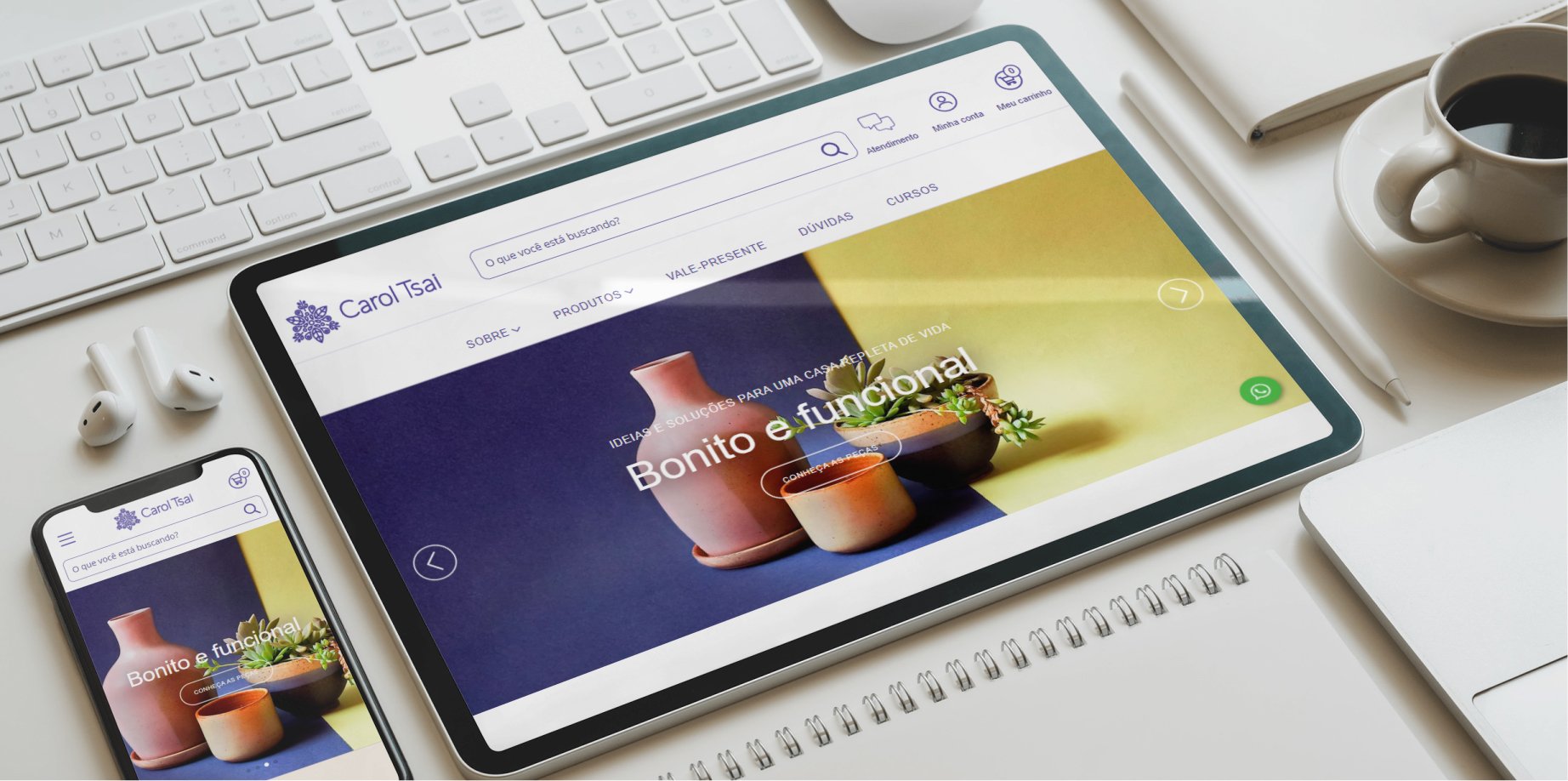
Cerâmica Carol Tsai e-comm home page
Discoveries and Sitemap
At our first contact with Carol Tsai we extracted interesting information from the interview that led us to some insights:
how could her online store leverage more sales?
how should sold-out products appear on the website?
would it be relevant to talk about the courses in her studio?
We also obtained some demographic data, informed by the ceramist herself:

Demographic data obtained by the ceramist’s Instagram, with about 11k followers
We also prepared a competitor analysis, where in addition to comparing ceramists who fit Carol Tsai’s business profile (some indicated by her), we also looked into corporate brands to understand different market behaviours, information architecture and usability of each one.
This was also a great exercise, as it showed us some patterns of behaviour in the business structures of competitors that, later, would make sense when interviewing users.

Competitor analysis matrix
We then conducted a qualitative interview with 4 users of Carol Tsai’s business website, among admirers and regular customers. We decided to also apply a usability test with Carol Tsai’s current e-commerce to validate some assumptions we had regarding the Information Architecture of her website, asking for 3 tasks to be done by 3 different users.
It was a very correct decision since from that moment on it became clear what problems the users were having when browsing. Those included doubts about the nomenclature for some product lists, the location of the “About Artist” and the general architecture of the pages.
It also helped us defined what our focus was going to be for the 5-day sprint.

Some discoveries made from interviews with users
With a focus on the plan of attack we had in mind (restructuring the information architecture of the site), we moved to create a Sitemap.
Creating this map was interesting for us to objectively clarify some doubts, such as duplicate descriptions or inconsistent organizations.
Points that precisely generated confusion among users when performing the tasks that we asked for in the usability test.

Our sitemap
Persona
With all this information in hand, we proceeded with the organization of the Affinity Diagram and Empathy Map.

Empathy Map — a tool that helps to structure the persona
We also defined the Job to be Done, that is, what the user is seeking to achieve through the brand and/or product, which helped us build our persona, which you will see soon.

Some user motivations that we define through JTBD
We then arrived at Sabrina. An architect with expertise in scenography, she frequents several artistic scenes in Sao Paulo and always chooses to consume from small local producers.
Motivated by consuming exclusive products, with added affectionate value, Sabrina is always willing to meet new artists.
But we realized that her experience with Carol Tsai’s e-commerce was not the best, as described below:

Our persona, her interests and frustrations.
Problem Declaration and Hypothesis
Users of Carol Tsai’s e-commerce who need to find products and information from the artist come across a confusing menu due to the playful, non-intuitive and ambiguous category nomenclature.
We believe that through a restructuring of the Main Menu and improvement of the Information Architecture (AI) of the website, the user will experience more efficient and objective navigation.
We will use a Heatmap analysis in the first 3 months after implementing the changes to obtain a reference for a success metric. Sales will also be monitored to evaluate if a positive impact was obtained.
Ideation and Prototyping
We went back to analysing the competing sites to better understand their behaviour patterns and evaluate what would make sense in our project.
We also applied the Card Sorting practice, identifying mental models that helped us to propose a new structure for the website.

Card Sorting done during the ideation process
Having identified, through research, that the first problem the user faces when browsing the website is the lack of a clear and objective organization (AI), we sought to find solutions while maintaining the current visual identity, since that part of the e-commerce was still satisfactory to the user.
Our objective in this first sprint was: to deliver an organized structure to facilitate the user’s navigation (and therefore, we believe, generate more sales).
So, we began building some low-fidelity wireframes (directly in Figma), where we did a concept test with a few users.

Iteration in the process of building the Low-Fi Wireframe, made with Figma
We also chose to bring the area about the artist to the main menu, as we identified that it is the first place that users look for this information.

Comparison between current website and our Wireframe in Mid-fi
And finally, we arrived at the medium-fidelity version of this project, where we also performed a test with the user to validate the proposed changes.
You can watch the result in the video below or interact with it by clicking here.
Mid-fi Wireframe developed with Figma
Next steps
If we could have future sprints, our main focus would be:
Analyse how out-of-stock products will be presented on the e-commerce website.
Evaluate and propose a catalogue of the artist, with pieces that will no longer be in production.
Analyses of the heat map to verify and validate changes.
Review formatting of the Artist’s “About” page.
Conclusion
This was another intense project with many lessons learned.
Every week I feel that we (the whole class) are more mature and confident in our choices and decisions.
Although we always think there will not be enough time, we manage to deliver! And I am proud because even though there are errors to be reviewed, the evolution is already noticeable.
The Design Thinking process now happens much more fluidly than it did 3 weeks ago and the choices for which tool to use start to be more natural. It is tiring indeed, but seeing so many results at the end of each week is very rewarding.